You ever hang up a new poster and think, “Wow, the colors just hit different”? That’s probably not a fluke. Good poster printing doesn’t just happen—it’s crafted, and a huge part of that magic comes down to four humble ink colors: cyan, magenta, yellow, and black. Together, they make up the CMYK printing process.
Now, unless you’re a designer or print nerd, you probably haven’t spent much time thinking about CMYK. But if you’ve ever been disappointed by a dull print or confused by how your screen and your paper can look like they’re from different planets—well, you’re in the right place.
What Is CMYK, Really?

Let’s break it down gently (no tech lingo avalanche, I promise).
CMYK stands for:
- Cyan (blueish tone)
- Magenta (purplish pink)
- Yellow
- Key (Black)
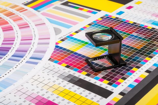
These four inks are used together in layers—like super tiny pixelated dots—to create basically every color your eyes can see on paper. It’s how most professional print shops bring designs to life. Think of it like a very disciplined team: each color knows its role and doesn’t try to hog the spotlight.
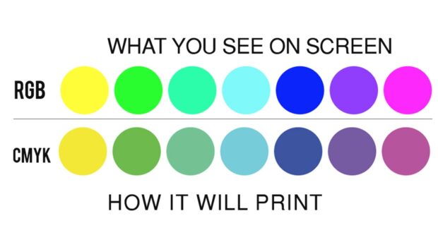
Why Screen Colors Don’t Match the Print
Ever made a gorgeous design on your computer, only to print it and end up with a sad, faded version? That’s the classic RGB vs. CMYK issue.
Here’s the thing:
- RGB (Red, Green, Blue) is for screens. It works by emitting light.
- CMYK is for paper. It works by reflecting light.
In other words, your monitor can show you glowing neons and super-saturated tones that paper simply cannot replicate. That’s not bad—it’s just a different medium.
So when you want something printed, especially something visual and bold like a poster, working in CMYK from the start saves you disappointment later.
How CMYK Elevates Poster Printing
Okay, now let’s talk poster magic.
If you’re planning to turn your artwork, photo, or design into something tangible (and beautiful), it’s worth using a printing service that actually respects your colors. This is where poster printing done right—using CMYK—comes in handy.
Instead of muddy hues or washed-out tones, CMYK printing offers:
- True-to-design colors
- Smooth gradients
- High clarity in small text and intricate details
- No surprise shifts in tone
You spend time perfecting your work. CMYK ensures it survives the journey from screen to paper intact.
When Color Accuracy Actually Matters
Not every print project needs ultra-fine color control. But for posters? Oh, it matters.
Think of:
- Event posters with detailed logos or brand colors
- Art prints where every brushstroke counts
- Photography where skin tones and shadows need to stay true
CMYK printing avoids weird tints, keeps shadows balanced, and doesn’t turn subtle shades of blue into toothpaste green (yes, that happens). It gives your poster credibility—like it belongs in a gallery, not on a dorm corkboard.
CMYK and the Sharpness Factor
Let’s talk crisp lines and fine detail.
You know that tiny text at the bottom of a movie poster? Or the pencil-thin outlines in an illustrated graphic? CMYK printing holds them together without bleeding or fuzzing. That’s because the dot placement is tightly controlled, and professional printers know how to adjust “dot gain” to keep things sharp.
It’s like painting with a scalpel instead of a brush.
So if you’re printing something that people will view up close—at an art fair, in a store, in a home—CMYK helps it hold up under scrutiny.
Versatility with Finishes
Here’s something a lot of people overlook: the type of finish you choose can change the feel of your poster completely, but CMYK plays nicely with both matte and glossy options.
Matte finish:
- Soft, velvety feel
- Great for vintage or minimal designs
- Works well in bright spaces (no glare)
Glossy finish:
- Vibrant, high-shine surface
- Colors appear more saturated
- Ideal for photography or bold illustrations
Whichever you choose, CMYK printing keeps the ink stable and prevents smudging or color pooling.
A Real-Life Print Mishap (and Redemption)

A friend of mine once printed posters for a local fundraiser. She was proud of the design—sunset gradients, layered textures, and a handwritten quote in soft white. She sent it off to a budget printer who, sadly, didn’t use CMYK.
The result? Blurry text. Orange skies instead of coral. And that delicate white font? Practically invisible.
She redid the job with a CMYK-based printer—and this time, everything clicked. Her reds were real reds, her shadows looked like shadows, and her quote? Clear, confident, and readable.
Lesson learned: Don’t skimp on printing if you want your work to be respected.
Setting Yourself Up for CMYK Success
Want to make sure your poster looks as good on paper as it does in your mind? Here are a few quick, practical tips:
- Design in CMYK mode from the start (most design software lets you switch)
- Use high-resolution files (at least 300 DPI)
- Avoid neon or super-bright RGB-only colors
- Always preview your file in print mode to catch issues early
- Export as PDF with embedded color profiles for best fidelity
And yes—print a proof if you can. It’s the best way to catch surprises before hitting “order 50 copies.”
Bonus Perk: CMYK Is More Eco-Friendly (When Done Right)
It’s not just about looks. CMYK printing is often more sustainable than you’d think. Because it uses just four ink types, there’s less waste than some spot-color or specialty ink processes.
And with modern printers using soy- or vegetable-based inks and recycled paper options, you can get top-quality without piling onto your carbon footprint. A small win—but one that matters.
Final Word: Quiet Precision, Bold Results
Here’s the thing: CMYK printing doesn’t scream, “Look how fancy I am.” It’s more subtle than that. But if you’ve ever held a poster that just felt right—that was balanced, rich in color, and sharp as a tack—you’ve probably seen CMYK at its best.
It’s the difference between “good enough” and “professional.” And honestly? If your work deserves to be printed, it deserves to be printed well.
So next time you’re planning a poster, don’t just focus on the design. Give a little love to the process that brings it to life.


